 Hands
Hands
Thursday, February 25, 2010
Monday, February 22, 2010
Thursday, February 18, 2010
Final Contact Sheet
 Contact Sheet
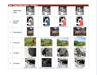
This project was done by the pictures on Flickr.com and Photoshop (mostly Image Settings and Crop). I originally wanted to do an all animal contact sheet, but I couldn't find the right picture for one of the row.
- For the first row, I used a picture of a dog in black and white. Originally, the picture was the resolution size of 1200 dpi and had a large width and height. To make the picture fit on one page, I went to Image Size to lower the height to 1 inch and the width was formatted after the change. After the first box, I lowered the dpi to the resolution sizes of 600, 300, and 72 and left the height at 1 inch (from right to left).
- For the second row, I used a picture of a black and white cat. First, I changed the height to 1 inch by going to Image Size. Then I went to Mode and picked different settings for each picture. Each picture was followed by the same procedure. The far right was the setting of CMYK which highlighted any colors of cyan, magenta, yellow, and black in the picture. The second right picture was the RBG setting which highlighted any colors of red, blue, and green in the picture. The far left picture was black and white, but the option on format modes that I chose was GrayScale. The second left picture was difficult to do at first, but I managed to make the picture a DuoTone. I had to change the picture to a GrayScale format, and then I was allowed to save it as a DuoTone.
- For the third row, I used a picture of an elephant. The landscape picture was the easiest because I just had to change the height to 1 inch and save it as that. The square took me a long time, but I found out the method. I went to the Crop button on the left toolbar and edited the measurements to say 1 inch for the height and width. I cropped the picture from the top corner to include the entire picture and moved the cropped box so I could include the elephant. The portrait was simple to do because I just lowered the width to 0.75 inch and kept the height at 1 inch.
- For the fourth row, I used a picture of a man in a field. The first step I did was to change the height to 1 inch and the width to 1.333 inch on the Crop measurements. Then, I continued to crop the same picture until there was only the man (Close-Up).
- For the fifth row, I used a small black Lab puppy. This row was tricky for me because I couldn't get the abstract box on the far left. First, I changed the height of the picture to 1 inch and the width to 1.33 on the Crop measurements. Then I cropped the picture to the dog's face, then the dog's right side of the face, and I ended with a close-up crop of the dog's right ear. I managed to crop in the right way so people would have to guess on the last picture.
- For the final row, I used a gray cat. To me, this was fun because it was simple. First, I changed the height of the picture to 1 inch and the width formatted to its correspondent. Then, I went to Filter to change the background settings. The first design I used was Crystalized because the picture was looked like it was shining. Then I used Glowing Outer Edges because the picture looked cool and funky. The Journalistic and CrossHatch were necessary so I used the formats as well.
Thursday, February 11, 2010
Final Font Poem

Final Font Poem Design Rationale
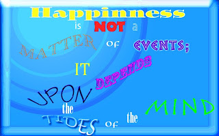
I chose this quote by Alice Meynell because happiness is something that many people want but do not know where to begin or how to obtain it. For the fonts, I chose
- ITC Ozwald Std for 'Happiness'
- Myriad Pro for 'is'
- Neuland LT Std for 'NOT'
- Myriad Std for 'a'
- Monotype Old Style for 'MATTER'
- Omnia LT Std for both 'of's'
- Pompeia Std for 'EVENTS;'
- Cambina for 'IT'
- Rosewood Std for 'DEPENDS
- Tekton Pro for 'UPON'
- ONYX for both 'the's'
- Lucida Handwriting for 'TIDES'
- Rusticana LT Std for 'MIND'
I chose these fonts because I liked the way they came out with the styles and arcs I applied. I wrote 'Happiness' in the center and at the top because it is the focus of the quote. For the phrase 'UPON the TIDES,' I wrote 'UPON' over 'the TIDES' because 'IT' happens from what is 'UPON the TIDES.' I thought the appearance looked cool and like actual 'TIDES.' For the pattern, I wanted it to flow from the top to bottom and from left to right. This way people can follow the quote easier. The main problem I had was trying to find a light background for the quote because the message is happy and I did not want a dark depressing background. Eventually, I found the background Blue Glass Button and played around with it. I brought the brightness level up to 54, the contrast level down to -26, the vibrance up to 100, and the saturation down to -97. I am most proud of the background design in the top left corner because it was hard to make something like that in Photoshop. If I had more time, I would either find a better background or think of a new pattern for the words.


