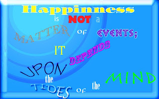
Final Font Poem Design Rationale
I chose this quote by Alice Meynell because happiness is something that many people want but do not know where to begin or how to obtain it. For the fonts, I chose
- ITC Ozwald Std for 'Happiness'
- Myriad Pro for 'is'
- Neuland LT Std for 'NOT'
- Myriad Std for 'a'
- Monotype Old Style for 'MATTER'
- Omnia LT Std for both 'of's'
- Pompeia Std for 'EVENTS;'
- Cambina for 'IT'
- Rosewood Std for 'DEPENDS
- Tekton Pro for 'UPON'
- ONYX for both 'the's'
- Lucida Handwriting for 'TIDES'
- Rusticana LT Std for 'MIND'
I chose these fonts because I liked the way they came out with the styles and arcs I applied. I wrote 'Happiness' in the center and at the top because it is the focus of the quote. For the phrase 'UPON the TIDES,' I wrote 'UPON' over 'the TIDES' because 'IT' happens from what is 'UPON the TIDES.' I thought the appearance looked cool and like actual 'TIDES.' For the pattern, I wanted it to flow from the top to bottom and from left to right. This way people can follow the quote easier. The main problem I had was trying to find a light background for the quote because the message is happy and I did not want a dark depressing background. Eventually, I found the background Blue Glass Button and played around with it. I brought the brightness level up to 54, the contrast level down to -26, the vibrance up to 100, and the saturation down to -97. I am most proud of the background design in the top left corner because it was hard to make something like that in Photoshop. If I had more time, I would either find a better background or think of a new pattern for the words.
No comments:
Post a Comment